ShopDreamUp AI ArtDreamUp
Deviation Actions


Suggested Deviants


Suggested Collections


You Might Like…


Featured in Groups


Description

 [link]
 [link]
_____________________________________
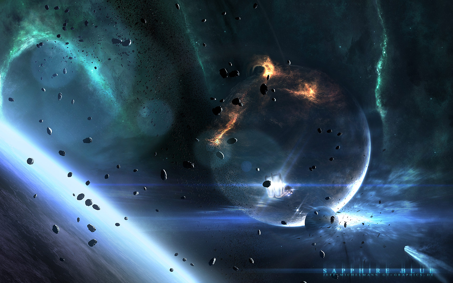
I present to you:
Sapphire Blue
Just a quick piece to release some stress during my current exams. Hope you like it
16:9
1440x810
1600x900
1920x1080
16:10
1280x800
1440x900
1680x1050
1920x1200
© 2010 - 2024 gucken
Comments206
Join the community to add your comment. Already a deviant? Log In
Vision: I love the composition; it really feels like I am hovering over the planet looking towards the sun. It feels like I am another spaceship following the one in front of me.
Originality: The art feels quite original, however it does have the typical direction of the sun; the perspective always usually leads to the sun, since that is the vantage point. I do not think it detriments the artwork though.
Technique: I think the color here is lacking; I think the gas in the background could use a bit more variety, though not alot. perhaps a bit more saturation in the gases as well would give it more life. The color of the fire on the large planet seem out of place. Perhaps a touch of red will give it an ember-like quality. Right now, the fire looks like a texture on the planet, and not something that is occurring to the planet. In that case, you might want to define these flames more, and the detail of what is going on. I feel that the light reflecting off the foreground world is a bit too bright, that it shifts my eyes back and forth from the sun and the engine lights of the ship to the world again.
Lastly, I think the asteroids do not help the artwork at all. If anything it blocks my way from fully experiencing the artwork. The asteroids are not the main focus here, but they behave as if they are, and it seems to clutter the scene quite alot. The asteroid ring behind does not, but the asteroids right in the front are really in the way.
Impact: It's a really nice work of space art, but I feel that it would be better if this piece was less cluttered by those asteroids so that it was cleaner and more spacious. It would be much easier to "breathe" and explore the work of art without them. Otherwise, great job mate <img src="e.deviantart.net/emoticons/s/s…" width="15" height="15" alt="